This blog is a special one for me because
it’s going to give you a chance to look in to my mind and see something that
I’m really passionate about.
If you recall from my first blog, I majored
in Sports Marketing in University. One of the things I got a chance to do was
make presentations and posters. When I managed a soccer tournament in
University, one of the posters I designed was for a promotion against racism.
I
discovered that I am quite a natural designer. It’s something I am really
interested in. When I was in University, I took a Photoshop & Illustrator
course. It was one of the most interesting courses I have ever taken. I learned
about how to edit and synthesize pictures, and create new photos.
Thanks
to this course, I was able to utilize my skills in a professional setting when
I went to work for the Samsung Lions, a Korean Professional Baseball Team. One
of the tasks was to post articles and posters on Facebook whenever the team
wanted to hire some new people.
You might remember that I also told you that I made
a new soccer team one month ago. Of course, when you have a team, you have to
have a logo. So, we had to decide our team’s emblem. At that time, nobody knew
how make one so, luckily, I got to design our emblem by myself.

This is
our team’s emblem which I designed. I wanted to emphasize our team’s name and that
we play soccer, so you can see the soccer ball background behind the bull. It
was an interesting task because I utilized my skills for my team and I made a
team’s emblem as well. It’s almost like I’m the owner of our soccer team! At
least that’s how it feels like to me.
After I started
working for Football BC, Daniel gave me a few design projects to come up with
some promotional posters, picture and logos. So now, I want to introduce these
pieces and explain my design concepts.
First,
this is the cover of Football BC’s Facebook page right now. The purpose is to
promote the Senior Bowl camp which is about to take place. For the background
picture, I chose one from last year’s Senior Bowl and edited it. Then, I
designed the letters and put it around the picture. I used these fonts and this
design because it looks simple, but effective and I think it can attract
interest.
So how
did I do all this?
First, I
reduced the size of the picture and amended it.
The top
photo is the original and the bottom photo is my edit. Can you find the
difference? It is little thing but it makes the picture stylish.
After
that, I changed the color of Senior Bowl logo and put it in.
Deciding
on a font was difficult because I wanted to use energetic and striking fonts but
not too casual ones. I ended up downloading fonts from the Internet. What do
you think? Is it cool?
These
two logos above are a bit of a secret right now, but I’m going to share them
with you.
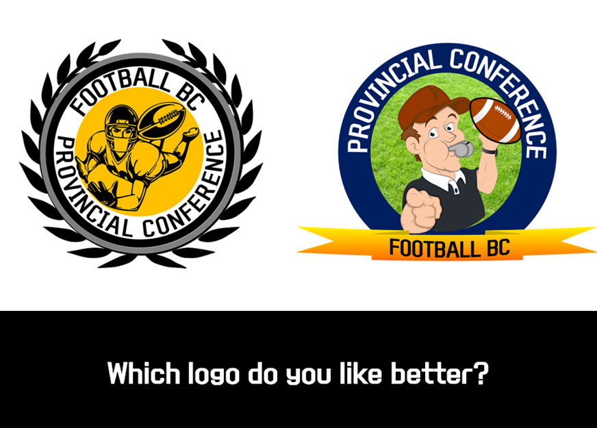
These
are two logos which I designed for the Football BC Provincial Conference. It
was a really difficult task because I couldn’t decide what theme to use and, as
a result, wasn’t sure what pictures to use. After some thinking, I came up with
two ideas..
Since
the Provincial Conference is a coach’s conference, my first logo (the one on
the right) shows a coach blowing a whistle. I’m not that satisfied with this
logo because it looks little bit casual for a conference. That’s why I decided
to make a second logo.
The
second logo (on the left) is also in a circle shape and with the laurel leaves
around it. Laurel leaves stand for honour and glory in the Olympic Games. Even
though I didn’t put a coach’s image in this logo, I think it expresses how important
and meaningful the Conference is for Football BC.
So now, I
want to ask you a question!
Which
logo do you like better?
I want
to hear your comments before we official decide on a logo for our provincial
conference!
If you
are wondering where I got my inspiration from, it actually is from one of my
favourite soccer teams, Bayern München. Their emblem looks simple but meaningful.
I wanted to emulate that design and keep it simple.
I am
really enjoying my design tasks at Football BC. I think I can upgrade my skills
through working at Football BC. Also, I want to learn writing skills from Daniel.
If I combine my design skills and Daniel’s writing skills, I think I can find
my dream job as a Sports Marketer.
If you
have a time, please give me some comments here on which logo you like the best,
and what you think of my designs!


Awesome <3
답글삭제